 Image: Design Soda
.
.
Today I want to show you the interior of a design hotel I visited recently which really challenged and inspired me, and which I’ve been thinking about ever since. Now, if you know much about me, you will know that the promise of cake and gin are two things I can’t resist, so when the lovely people at Amara invited me to an evenings afternoon tea and cocktail sampling last month I couldn’t resist. And at The Sanderson too, I knew it was a 5 star hotel in central London, designed by Philippe Starck, and Amara have form with choosing amazing venues (see Ham Yard, Rosewood etc) for their soirées so I was excited to see what The Sanderson held in store.
.
.


Images: Design Soda
.
.
It was pretty out of this world in honesty, I only had my iPhone on me as I figured DSLR’s weren’t an appropriate accompaniment to cocktail dresses (!) so you’ll have to excuse the quality of photos. The taste at The Sanderson is written with broad strokes of boldness and a presence that forces you to look and consider, like the Jeff Koons of the hotel world. There’s the expected here too, like the pinks, brass and marble (above) which everybody loves. But there’s also something about it which is entirely out of my design vocabulary. I can Identify the references – Fornasetti on the bar chairs, or Dali’s Mae West lips sofa in the foyer for example. But there’s something else about this design which feels knowing, like it has one over on you, it’s bold but there are layers behind it to decipher.
.
.


Images: Design Soda
.
.
Housed inside the former Sanderson head office, a less interesting designer may have made this design into something of a Mad Men pastiche. Not Starck, his touch is a juncture from the past with a hint of bling to it (check out the Venetian etched glass on the lift facades above). In some ways this brashness is the opposite of my signature style, and yet I have been thinking about it ever since. Why do I think of David Lynch when in the lime green corridor? Is it simply the red room in Twin Peaks, or is there something eerie, perhaps even sinsister about the feel, despite its beautiful murano chandeliers? What is the purpose of the stained glass window in the foyer that spans two floors? Is it original? Why am I thinking about Pharrell Williams in the lift with its projected infinity of solar system walls? I just don’t know, there’s something very Pop Art about all this referencing but it’s something I haven’t worked out yet. There are a lot of question marks here, but that’s what great design is, isn’t it? Well I’m still thinking about it. What impression does it make on you?
.
.


Images: Design Soda
.
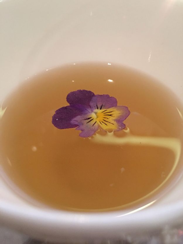
One thing I do know is that this was an inspired venue choice by Amara, and I’d like to thank them very much for both the design journey and the fabulous afternoon tea which you can see pictures of above. I leave you with the menu and that Lynch-ian corridor again.
.
.


Images: Design Soda
.

