.
[ad – this post is a collaboration with Kallums bathrooms]
After many years of making do and waiting, I am thrilled to be sharing our bathroom makeover in collaboration with Kallums Bathrooms today. If you hop back a few posts to our bathroom plans, you will be able to see the sorry state of our previous bathroom, and my plans to create a new space which would give me the feel of a hushed haven of simplicity and elegant minimalist design. I knew that I would be thrilled to have a bathroom without leaks, what I didn’t fully anticipate was how much I would love the new space. It feels very high-end and sophisticated without drawing attention to itself, and the soft new palette and quality bathroom fittings are a far cry from the inky blue bathroom it replaces.
.
The Look

.
My brief when I moved in was to make as much space as I could, on a shoe string budget to give the space some personality and direction. I definitely achieved that, and though I was a little tired of the look six years later, it was rectifying both the bad installation of our previous bathroom (my previous bathroom fitter wrote the book on bathroom botching!) and investing in quality materials that stood the test of time. With quality in mind, I wanted this bathroom renovation to have a look which would stand the test of time, our previous bathroom was ahead of the trend curve, but a year later and many of the aspects of it had become standard bathroom fare – metro tiles, brass fittings, vintage rustic texture.
.

.
My idea of how this bathroom would look was almost anti-design, I determinedly eschewed all the trends I am drawn to (reddish marbles, Zellige tiles, black hardware) and focused instead on the essence of how I wanted a bathroom to feel. I decided I wanted something minimal and simple but most definitely not clinical, it needed to feel like a calming retreat, but without any of the hotel spa vibes.
.
The Details
.

.
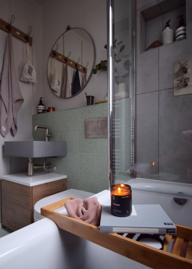
I wanted a bathroom which would celebrate material and texture, but which would also have definite lines and would be easy to clean. Very high on my wishlist from the outset was a Kast concrete basin, I have admired these for years, from the sculptural fluted ones in pastel colours, to the utilitarian vintage style designs with back mounts, and of course the very simple but very striking Nilo basin design I picked. Each Kast sink is made bespoke in its own mould, so after you have chosen your design and which of the 31 colour ways you want, you receive a really special piece which is a showstopper of an accent point.
.

.
Fittings
.
 .
.
For the hardware I picked some really beautiful pieces in a brushed nickel finish in the shower from Coalbrook, they have some of the warmth of brass with a timelessness that won’t date. I kept the waterfall shower and the hose very simple, making more of a play of the taps with their stunning cross handles design. For the concrete basin, I chose a very simple brushed nickel tap from Crosswater.
.
The Tiles
.


.
I spent a long time looking perusing tiles since they would be the jump point for everything else. Over a hundred samples later, I decided to go for a, fairly pricey, soft sage terrazzo tile called Bosello by Fired Earth. I love the irregularities of micro terrazzo, it’s a material I will never tire of, we have larger format designs downstairs and this was the perfect way of bringing some green in to the bathroom (my first colour thought for the room was a shade of mint). Against the soft green of this tile, I wanted something harsher in the shower area, I felt that white may wash out the effect of the terrazzo. After a visit to their Shoreditch showroom I chose a, very reasonably priced, large format concrete effect tile called Concretopia in the Smithson from Claybrook Studio.
.
Practicalities
.

.
As with all heavy traffic spaces, there were a number of practical considerations I was very glad to have the expert knowledge of bathroom designer Xavier at Kallums on hand for. I knew that we would have to remove our Victorian window frame and replace it with new double glazing. I was sad to loose the character of this, but two people showering against it each day was a step too far in style over substance. The bath had also been an issue in our previous space, I had purchased the very cheapest plastic bath, and no matter how slight you are (we are not!), the movement of getting in and out of the bath will take its toll on how watertight your space is. Xavier chose a stunning streamlined stainless steel bath from lux bathroom stalwarts Bette, not only does it look stylish, but for the first time in six years my feet hit solid ground when they hop into the bath.
.
 .
.
The central space of the bathroom has to house both sink and toilet. Here Xavier designed a space with boxing in, which allowed the waste of our Saneux toilet to be hidden within a streamlined frame. The space we have gained can probably be measured on a ruler, but in such a small space it’s impact is great. The final practical decision was lighting. I chose recessed spotlights with an IP65 rating so that they would be safe in all bathroom zones. Spaced well to avoid any possibility of shadows, recessing lights is such a small detail, that makes the hugest difference to the ambience of your space.
.
Colour
.

.
Having chosen two different tile designs, I needed a shade which would unify the two. The bathroom needed a shade which mirrored the soft pastel of the green and the slightly harsher feel of the grey. I wanted a soft grey to tie in both of the cool tones, but also a very soft and pastel like grey. I chose Cornforth White by Farrow and Ball, an understated neutral with a slight earthiness, we have previously used in my sons bedroom. It’s the perfect shade as it balances a little warmth into the coolness of grey and feels very uncomplicated and calm.
.
Styling
.

.
The final thirty per cent of impact in a room (I think), is made up of the 5-10% of items you add in to style it. These will contextualise a space, providing meaning to the materials, and if you strike the balance right they will lead the eye on a cohesive journey. For years I have been collecting the odd piece of Scandinavian bathroom textiles to cheer up our tired space and as they are well made with good quality materials I repurposed many of them in the new space. I’m really drawn to simple Scandinavian design in many settings, but particularly bathrooms where a few well chosen items can really elevate the look. I spotted my new Dowel mirror by Kristina Dam Studio at a press show in spring, it had been on my radar for a while, in fact it had been on my bathroom wishlist from the start. I made a beeline for it, checking to see if the simple wooden dowel and brushed metal frame were as impactful in their style and simplicity as I expected, they were.
.

.
This huge mirror (particularly huge in the space) reflects so much light into the room and expands the feeling of space so well. We have kept our old coat pegs as a towel rail and added a couple of Attach coat hooks from the new range by Scandinavian design studio Muuto. I have never had a long ledge to place useful toiletries on before, and I have had to really reign myself in from placing everything I could ever want there. The shelf contains a few daily necessities housed in minimalist packaging and a small inexpensive stone vase from H&M with some faux eucalyptus greenery (I don’t really trust real plants in the bathroom). The vanity is a really streamlined piece with a dark solid oak drawer, positioned just slightly off the ground so that they eye can detect space underneath.
.


Items used in makeover
(those with * were part of gifted collaboration with Kallums bathrooms, ** items with a press discount)
Nilo Basin, Kast Concrete Basins
Brushed Nickel Shower Fittings, Coalbrook*
Green Bosello Terrazo Tiles, Fired Earth
Grey Concretopia tiles, Claybrook Studio
Luxe bath, Bette*
Dowel Mirror, Kristina Dam Studio**
Basin Tap, Crosswater*
Attach coat hooks, Muuto
Uni Rimless wall hung toilet, Saneux
Cornforth White estate emulsion and eggshell, Farrow & Ball*