.
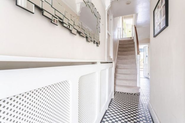
A home is never finished. Or so the adage goes. There’s always another area to tackle, something goes wrong (no-one talk to me about the recurring leak in our bathroom!), a repurposing of a space is required, there’s a new approach you want to take somewhere , a new feeling, a quick refresh or a rethink. Finished is never finished. And yet I feel we are about as finished as we are ever going to be. We moved into our house four years ago next month, and the house now looks very different to the home we moved into. With a pretty minimal budget, no structural changes and a lot of licks of paint, I can comfortably claim that I feel this space is now ours. So, in the spirit of a little self indulgence I thought I’d share a little look back on our journey so far, with a mini house tour and chat about what I think we’ve got right, and what I’ve learnt from the process. But first, and for the first time in full on the blog, I want to pause for a second on the house we inherited. Even though I was blogging in those days, I didn’t capture the house myself when we moved in, so my visual archive comes via the estate agent pics and as a result they are all in landscape and a little fish eye in perspective.
.


.
Champagne tastes can be worked on a lemonade budget.
Our budget has been very limited in most spaces. I have been very lucky to work with many brands I love over the last few years and though our rooms are now quite beautifully dressed thanks to selective brand involvement, we have spent nothing on big changes, so I want to talk a little about the big impact of using the money you have on the right things.
.


.
A home, not a magazine.
But I think first it is important to mention that sometimes expectations of our homes can be out of sync. Most of us don’t live in spaces straight out of magazines (to be honest you probably don’t really want to either), it’s the people and the patina of the objects that make the space feel familial and homely. This is our first house, it’s Victorian, with high ceilings and some character, but it’s also a fairly small three bed, and it’s not perfect, and it’s never going to be a cavern of open plan living or opulence, but it is cosy in a way that feels inviting to me and not contrived. I have highlighted what is elegant or characterful and tried to add layers and texture to create a laid back feel in line with how we live.
.


.
I am pretty happy (and a little proud) of how our home now looks, I credit you with knowing that of course my home gets messy, dirty even, outside of pictures. My husband has been threatening to open up his own Instagram account to counter the Design Soda one documenting the mess and the problems (seriously, no one mention the havoc of the bathroom leak to me!) to counteract my curated images. I think you all know that life in pictures is only one small section of my reality, so let’s take that as a given. The expectation that a home can look perfect is a fallacy, but I am slowly learning to make our space sparser and more streamlined in an attempt to cut down on mess.
.


.
A House is a Machine For Living In.
I love this motto from Corbusier, and though I am not a sparse modernist by any stretch, I can appreciate the foundations of this, it underpins most Scandinavian design, that function is the heart of everything. Placing the house as a tool that enables living, placing the practical alongside the pretty when you’re draw up your design brief, will make a space more efficient and therefore increase well being in a home. As a shift in society means we have begun to move away from years of disposable pieces, I would humbly suggest that, as many have written about more expansively already, the materials you choose for the home and the honesty of the design will all impact upon the overall space and it’s longevity as a backdrop for story telling. Don’t overlook repurposing items you love looking at to make them suitable for modern living. Pigeon hole drawers that hold CD’s, credenzas that don’t hold crockery but are actually your dvd storage, unusual items that will hold toys and look stylish, these are all found in our home. If you eschew the ways you’ve been told modern storage works I think you will end up with something far more interesting and layered. I can’t lie, three rows deep, our dvds can be hard to navigate (particularly by family members that don’t understand the category system!) but I wouldn’t change this way of storing them for anything.
.


.
Colour Me In.
I may have saved the best til last here! Each time I’ve worked with a client on their space where the referral has come through the blog or Instagram, the client has invariably told me at some point that they chose me partly for the colour palettes I use. Beyond being very flattered, I think this has something to do with people being drawn to colours which are colourful but not punchy, I tend to use colours which easily recede (whether dark or light) and which don’t dominate. But I am also a huge colour lover and can read endlessly about the theory behind it. Paint is not only the quickest and cheapest change you can make in a home, it is also the most impactful. If I were to give one piece of advice on this I would suggest following your gut and not loosing your nerve, but if you want to read more about my ideas on colour, have a look here.
.


.
Finally, I wanted to write this post now as I think it’s important to show that our home has not evolved overnight. We didn’t arrive here with 20k to spend on decoration (who does?!), so straight out of a magazine it isn’t. But actually that’s the beauty of a home, how it evolves to tell the story of you and your time there. Ted will be moving from the small back bedroom to the larger study soon, so some changes are afoot. But, right now, I am very pleased with this space we call home.
.


Liked the way you have given your view on the things which are mandatory for the house, how you experimented with the designs for the perfect place of your choice and the importance which you have given to the clarity of content was astonish and well-believed as anyone can make their house the way they want while taking things slow and working on the process.
Thank you so much, I definitely think a slower approach brings better results ??
Pingback: Top 5 Scandinavian decor tips - Daily Dream Decor